Walking the City by Feel, Guided by Color

Join us as we explore using color psychology to plan emotion-driven urban photography routes, transforming spontaneous wandering into purposefully crafted walks that invite specific feelings and stories. We will connect palettes to places, moods to light, and curiosity to practical planning, so every turn deepens intention. Expect actionable mapping tips, field-tested anecdotes, and creative prompts that help your images resonate, even on familiar streets. Bring your camera, comfortable shoes, and an open heart for color.

Why Colors Change How Streets Feel

Cities hum with coded signals, and color is one of the strongest languages they speak. Cultural meanings, saturation, scale, and context merge to shape how we move, wait, buy, and breathe. A crimson bus lane heightens urgency, a cobalt river cools the pulse, and a saffron market quickens conversation. Understanding these cues lets you design walks that deliberately evoke calm, anticipation, nostalgia, or spark, guiding frames toward emotional clarity rather than accidental coincidence.

Red Corridors and Urgency

Follow the path of taillights, construction netting, and stop signs, and you will feel tempo increase before you lift the camera. Red compresses patience and sharpens attention, especially where traffic funnels and decisions pile up. Use faster shutter speeds to echo the heartbeat, crop tight to emphasize pressure points, and look for micro-contrasts—like a pale hand against a crimson door—that turn urgency into narrative rather than noise. Balance the heat with shadow to avoid overwhelm.

Blue Havens and Breathing Space

Seek reflections in glass towers, quiet river bends, shaded underpasses, and late-twilight sidewalks washed in indigo. Blue invites slower rhythms and longer gazes, rewarding broader compositions that exhale gently. Experiment with cooler white balance and steadier frames, allowing motion to soften into texture rather than command attention. When a passerby pauses near a steel-blue facade, wait for a small gesture—loosening a scarf, checking a map—that lets calm gain a human anchor and emotional foothold.

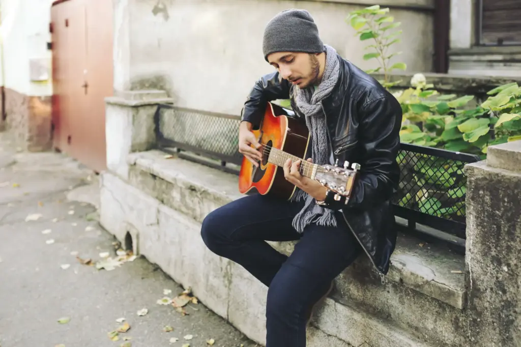
Yellow Energy Around Commerce

Markets, corner bakeries, taxis, and sodium-vapor lamps radiate yellow that feels conversational, playful, and slightly electric. In these zones, laughter shortens distances and bargaining turns into choreography. Use mid-range focal lengths to keep proximity without crowding, and meter carefully so highlights stay lively without bleaching nuance. Pair yellow with pockets of neutral gray to frame warmth, or let a splash of blue cut through, setting friendly buzz against a cool reply and guiding the eye with musical contrast.

Collecting Color Data Before You Walk

Scrape geotagged posts, scan satellite views for roof tones, and browse local business photos to sample palettes in advance. Build a small reference board with approximate hues you expect to find, noting patterns like recurring red banners or teal tiles. Mark intersections where colors collide, such as transit hubs near murals. This prep does not predetermine shots; it primes awareness, helping you arrive attuned to possibilities, ready to respond when light, wardrobe, and chance align in resonant harmony.

Timing the Palette: Light, Season, and Shadow

Golden hour nudges brick toward amber and skin toward glow, while blue hour cools concrete and pulls neon forward. Overcast saturates paint while muting glare, ideal for subtler emotional notes. In winter, low sun stretches highlights along facades; in summer, harsh noon carves graphic contrasts. Study how shadows travel across chosen streets, forecasting where colors will bloom or recede. Plan transitions to match mood shifts, ensuring your sequence feels inevitable, not stitched, as light carries feeling forward.

Tools That Honor Hues

Gear is not the point, yet choices shape how faithfully color carries feeling. Prioritize consistent white balance, reliable metering, and lenses that render contrast without strangling subtlety. Calibrate displays and consider neutral picture profiles to protect headroom. Filters can tame glare or enrich skies, while diffusion softens brittle highlights. Pack lightly so movement remains fluid and curiosity unburdened. Tools should translate intention, not dominate it, letting the city’s palette remain the star and your direction stay clear.

White Balance as a Mood Dial

Lock Kelvin rather than riding auto to prevent mood drift across your sequence. Warm settings can deepen comfort in cafes and markets; cooler values can articulate solitude near glass and water. Carry a gray card to establish a consistent baseline, then deviate deliberately when storytelling calls. When mixed lighting complicates skin, meter for faces and protect highlights. Think of white balance as narrative voice—steady, credible, and expressive—guiding viewers through shifting light without losing emotional continuity or tonal trust.

Lenses, Filters, and Compression

Use a moderate wide to include environmental color relationships, or a short telephoto to compress stacked signage into harmonic blocks. A circular polarizer can lift reflections from windows or deepen skies, but rotate gently to avoid unnatural uniformity. Diffusion filters can soften harsh noon, preserving color while easing micro-contrast. Mind edge performance where critical hues sit near the frame. Choose gear that supports your intended pace: nimble, close, and conversational, or patient, distant, and quietly attentive to shaped space.

RAW Discipline and Post Foundations

Expose to protect highlights in neon and reflective metal, then shape color gently in HSL rather than nuking saturation. Establish a neutral starting profile so edits remain traceable. Use selective color to guide attention, but resist shortcuts that homogenize surfaces into plastic. Calibrate your monitor, soft-proof for web or print, and review on a phone in daylight. Post should reinforce the emotional map drawn on foot, not overwrite it, preserving lived nuance, texture, and the city’s uncoached voice.

Sequencing a Walk that Breathes

Opening Notes and Establishing Palettes

Begin with generous breathing room: cooler tones, longer lines, and steady horizons that introduce your viewer gently. Include a quiet human gesture to invite empathy without forcing excitement. A pale storefront, soft sky, and measured stride set a trustworthy baseline. As the second or third frame adds warmth, the viewer feels the shift rather than reads it. Establishing shots are contracts, promising clarity and care while planting subtle cues about where your color journey intends to lead.

Transitions That Carry Emotion Forward

Transitions are where routes either fracture or sing. Use alleys, stairwells, transit platforms, or underpasses as bridges, letting neutrals or patterned shadows reset the palette. Then introduce the next hue family with a small, meaningful detail—a scarf, crate, sign—before unleashing the fuller scene. Maintain rhythmic variety in distance and angle so shifts feel motivated, not mechanical. When a gust flips a poster or a bus arrives early, accept the invitation and pivot, trusting your emotional arc to flex gracefully.

Closing Images and Afterglow

Land the sequence with warmth or thoughtful quiet, depending on your intended lingering emotion. Golden streetlamps on wet pavement create reflective calm; a last laugh beneath a yellow awning offers uplift. Reintroduce a motif from earlier—a color, pattern, or subject—to bind the journey. Keep edits gentle so the final frames breathe. Invite the viewer to rest, comment, and imagine their own walk tomorrow, carrying your palette forward as a personal map rather than a finished, sealed conclusion.

People, Permission, and Presence

Approaching People With Respectful Signals

Soften your approach by lowering the camera, matching pace, and allowing an exit. A gentle smile and a visible pause create room for a nod or shake of the head. Colors you wear can cue openness; a muted jacket disrupts less, a bright scarf invites conversation. When words fail, show the last frame and gesture your intention. If declined, thank sincerely and move on. Your emotional map honors dignity first, understanding that trust paints the richest tones in any portrait.

Navigating Private Spaces and Events

Shops, markets, and community festivals offer expressive palettes, yet boundaries vary. Ask before lingering, especially near counters, families, or sacred items. Explain your project in simple, specific terms, and offer to share selects later. Colorful signage can become both subject and permission gateway—photograph from public space unless invited deeper. When a vendor invites a closer look, show care with composition and time. Leave a card if appropriate. Reciprocity turns a quick frame into an ongoing, respectful relationship.

Staying Safe When Colors Get Loud

Neon districts, rallies, and nightlife pulse with saturated drama and unpredictable currents. Scout exits, keep pockets zipped, and shoot with minimal footprint. Position yourself near reflective surfaces that brighten scenes without blinding subjects. Watch for sensory overload; red strobes can fatigue judgment. Travel with a friend after dark and trust your instincts. If tension spikes, lower the camera and give space. A compelling image never outweighs safety. Let prudence guide the route, and let tomorrow offer another chance.

Adaptable City Routes to Try

Use these flexible outlines as springboards rather than scripts. Swap neighborhoods, adjust timing, and follow serendipity while keeping an emotional throughline. Focus on palettes and transitions, not rigid landmarks. Each walk models a mood arc—calm to spark, spark to reflection—so you can transplant the structure into your own city. Share your results with our community, noting detours that improved flow. Your version will differ beautifully, proving that color-guided intention thrives on local texture and personal curiosity.